Shopify Product Image Size: The Complete Guide (2026)

Best Shopify Product Image Size
2048 × 2048 px is the standard recommendation for Shopify product images. That size handles zoom quality on all devices, works on retina displays, and covers Shopify’s full CDN resolution range. Square 1:1 is the most compatible aspect ratio. It renders reliably across Shopify themes, Google Shopping, and other sales channels.
Shopify’s official guidance on accepted formats, file size limits, and upload requirements is in the Shopify product media documentation.
| Requirement | Spec | Why it matters |
|---|---|---|
| Recommended dimensions | 2048 × 2048 px | Covers zoom, retina displays, and all CDN breakpoints |
| Minimum for zoom | 800 × 800 px | Below this, zoom views become pixelated. Also the Google Merchant Center minimum. |
| Maximum file size | 20 MB | Shopify's per-image upload limit |
| Recommended aspect ratio | 1:1 (square) | Most compatible across themes, feeds, and shopping channels |
| Accepted formats | JPEG, PNG, WebP | WebP is served automatically by Shopify's CDN from JPEG or PNG originals |
Why 2048 px specifically? At that resolution, Shopify can serve any of its CDN breakpoints from a single upload, including the largest variants used on big desktop displays. It’s also the right size for zoom. Both the hover-zoom magnifier and the click-to-zoom lightbox pull from the original file, and at 2048 px you get sharp detail at 2× magnification on any screen. Going larger doesn’t improve the visible result but does slow uploads. Going smaller risks blurry zoom or rejected images on Google Shopping feeds.
Square images work well for most stores. Every Shopify theme handles 1:1 reliably, and Google Shopping and Amazon both prefer it. If your store type calls for a different ratio, that’s covered in the next section.
Why Shopify Product Images Display at Different Sizes
Mixing aspect ratios across your product images can cause the gallery to jump as customers navigate between slides. Not every theme does this though. Themes that use a fixed-height container or object-fit: cover CSS fill a set area regardless of each image’s natural proportions, so those don’t jump. The jumping only happens in themes that resize the container to match each image’s actual dimensions. If you’re not sure how your theme works, open a product with images of different shapes and click through. If the page layout shifts, you’ve got a jumping gallery.
Using a consistent ratio across all your images is the permanent fix. The GG Product Page Image Slider can also handle it without re-uploading anything. Its Fixed Ratio setting locks the gallery container to a specific ratio regardless of the actual image dimensions, so mixed-ratio images display smoothly.
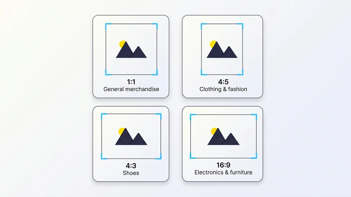
The right ratio depends on your store type:
| Store type | Recommended ratio | Notes |
|---|---|---|
| General merchandise | 1:1 (square) | Most compatible across platforms; default for Google Shopping and Amazon |
| Clothing and fashion | 3:4 or 4:5 | 4:5 covers Instagram feed and Reels; 3:4 suits Zalando-style marketplaces. Both come naturally from one vertical shoot. |
| Shoes | 1:1 or 4:3 | Square or slightly landscape; keeps toe box and sole visible without cropping |
| Electronics, furniture | 4:3 or 16:9 | Landscape suits wide products; verify your theme's gallery rendering before committing |
A 2025 survey of 150+ fashion ecommerce brands found that 2:3 was most common (~28%), followed by 1:1 (~19%) and 4:5 (~18%). Fashion brands lean toward vertical formats, and with Reels and TikTok now driving most social discovery at 9:16, many plan a small suite of ratios. Typically 1:1 for product grids and Google Shopping, 4:5 for social feed, all derived from one vertical shoot. If you’re not on social channels or tied to marketplace specs, 1:1 is the safest default.
Shopify Mobile Image Size
Shopify’s CDN has smaller image variants ready and serves the right size based on the visitor’s screen (see Shopify’s product media docs). You don’t need separate mobile uploads. Not all themes actually use this though. A theme that outputs a plain <img src> tag instead of using srcset sends your full 2048 px upload to every visitor, including someone on a 390 px phone. That’s roughly 5× more image data than the screen can show. It loads slower and wastes bandwidth for no visible benefit.
Whether or not your theme handles this correctly, the GG Product Page Image Slider manages responsive image loading for the gallery on its own. It builds image elements with srcset across 15 resolution breakpoints and adds lazy loading for off-screen slides. Images also decode asynchronously so they don’t block the rest of the page from rendering. All of this is independent of the theme. The full technical details are in the advanced section below.
The app also has independent mobile configuration. You can set a separate aspect ratio, layout, navigation style, and arrow settings that only apply below the mobile breakpoint. So you can show 4:5 vertical on mobile while keeping 1:1 on desktop, with no theme code changes.
Zoom and Google Shopping Image Requirements
Zoom needs enough resolution in the source image to stay sharp. The GG Product Page Image Slider uses the original uploaded image for its hover-to-zoom magnifier and click-to-zoom lightbox, so below 800 × 800 px the zoomed view comes out pixelated. Uploading at 2048 px means zoom stays sharp at any magnification level.
Google Merchant Center also enforces 800 × 800 px as the minimum for product images used in Shopping ads. Images below this size are disapproved. Uploading at 2048 px covers both requirements with room to spare.
Shopify Image File Formats
| Format | Best for | Target file size |
|---|---|---|
| JPEG | Product photos, lifestyle images, any image with backgrounds | 100–300 KB |
| PNG | Transparent backgrounds, product cutouts, graphics with text | 200–500 KB |
| WebP | Served automatically by Shopify CDN. No upload needed. | — |
| GIF | Avoid for product images. Large file sizes, poor quality for photos. | — |
Upload JPEG for photos and PNG when you need a transparent background. You don’t need to upload WebP files. Shopify converts and serves them automatically when the visitor’s browser supports it.
For JPEG compression, most image editors default to quality 90–100, which produces files much larger than needed. Quality 70–80 typically lands in the 100–300 KB range for a product photo with no visible difference at normal viewing sizes. PNG files with transparency tend to run larger. If file size is a concern, check whether your product images actually need the transparent background or if a white background JPEG would work just as well. GIF isn’t a practical choice for product photos. You only get 256 colors, quality on photographic images is poor, and file sizes end up large.
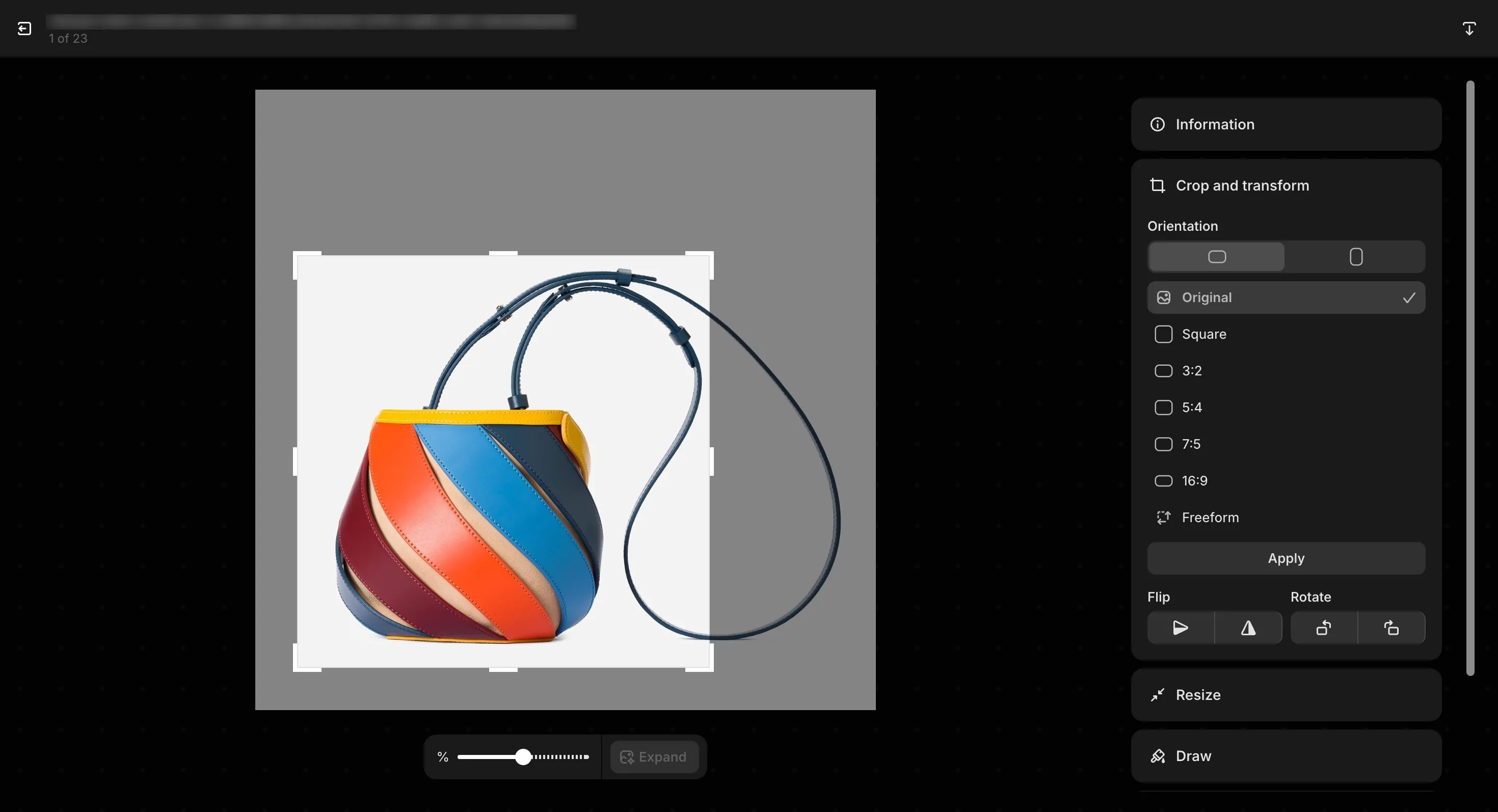
How to Adjust Image Size in Shopify
If your Shopify product images are different sizes in the gallery, you’ll want to fix that at the source or at the gallery level. When a Shopify product image size is too big for the 20 MB upload limit, the file gets rejected. Compress it first, targeting 100–300 KB for JPEG product photos. You can use Shopify to adjust image size directly through the built-in media editor. For display inconsistencies, the steps below cover your options.
For a small catalog, re-cropping through Shopify’s built-in media editor is the most direct path. For large catalogs, preparing images at a consistent ratio before uploading in bulk is faster. If re-uploading isn’t practical (third-party image feeds, time constraints, a few hundred products), the Fixed Ratio setting handles it at the display level without touching the source files at all.
Step-by-step guide for diagnosing and correcting product images that cause gallery jumping or display inconsistently.
- Identify the inconsistency: Go to a product page in your store and click through the gallery. If the page layout shifts as you navigate between images, the images have different aspect ratios.
- Crop images using Shopify's media editor: In Shopify admin, open the product, click on an image thumbnail, and select the crop option. Set the target ratio, crop, and save. Repeat for each inconsistent image in the product.
- Re-upload standardized images in bulk for large catalogs: Prepare all product images at a consistent ratio and dimensions outside of Shopify (for example, 2048x2048 px for 1:1), then replace the originals by uploading the new files to each product.
- Use Fixed Ratio in the app for an instant no-upload fix: Enable Fixed Ratio in GG Product Page Image Slider and choose your target ratio (square, 3:4, 4:5, etc.). The app applies it to the gallery container right away. No image changes or re-uploads needed.
Shopify CDN Image URL Parameters (Advanced)
This section is for developers and technically-minded merchants who want to understand how Shopify serves images, or who are building custom Liquid sections, email templates, or open graph meta tags.
srcset and responsive image loading
srcset is the browser standard for loading the right image size per device. Shopify’s CDN has the variants ready, but they’re only served if the theme’s HTML outputs srcset and sizes attributes on the image element. Not all Shopify themes do. A theme that outputs a plain <img src="..."> sends the full 2048 px upload to every device. On a 390 px phone screen, that’s about 5× more image data than the browser needs.
The GG Product Page Image Slider builds its own image elements with srcset across 15 resolution breakpoints. Off-screen slides are lazy-loaded, and images use decoding="async" so they don’t block page rendering. This works the same regardless of whether the theme implements any of it.
CDN URL transformation
Shopify’s CDN supports on-the-fly image transformation via query parameters appended to the CDN URL. You’re not limited to a fixed set of sizes. The width and height parameters accept any value up to 5760 px.
# Resize to 800 px wide (height auto-calculated from aspect ratio):
https://cdn.shopify.com/s/files/.../product.jpg?width=800&v=...

# Resize to 400×400 and crop to center:
https://cdn.shopify.com/s/files/.../product.jpg?width=400&height=400&crop=center&v=...

# Extract a specific region, then resize the result:
https://cdn.shopify.com/s/files/.../product.jpg?crop=region&crop_left=32&crop_top=32&crop_width=512&crop_height=512&width=100&height=100&v=...
At least one of width or height is required. If you provide only one, the other is calculated from the image’s aspect ratio. Images can’t be upscaled beyond their original dimensions.
The crop parameter controls how the image is trimmed when your requested dimensions change the aspect ratio. Values: top, center, bottom, left, right, and region. Use region with crop_left, crop_top, crop_width, and crop_height to extract a specific rectangular area. You can also convert the format with format: jpg or format: pjpg, or pad the image to fill the requested dimensions using pad_color with a hex value (instead of cropping).
In Liquid, the image_url filter builds these URLs for you:
{{ product | image_url: width: 800 }}
{{ product | image_url: width: 400, height: 400, crop: 'center' }}
{{ product | image_url: crop: 'region', crop_left: 32, crop_top: 32, crop_width: 512, crop_height: 512 }}
The GG Product Page Image Slider uses these parameters internally to request the right image size per device, keeping page load fast without sacrificing full resolution for zoom. Full parameter reference: Shopify image_url filter docs.
Frequently Asked Questions
- What is the best size for a product image on Shopify?
- 2048 × 2048 px at 1:1 square is the standard recommendation. It covers zoom quality on all devices, works for retina displays, and fits within Shopify's CDN resolution range. Keep file size under 20 MB. JPEG for photos, PNG for transparent backgrounds.
- How do I change the size of my product image in Shopify?
- Open the product in Shopify admin, click on an image thumbnail, and use the built-in crop tool to adjust the dimensions and aspect ratio. For large catalogs, prepare images at a consistent size and ratio before uploading. Or use the GG Product Page Image Slider's Fixed Ratio setting, which enforces a consistent display ratio across the gallery without re-uploading.
- Should Shopify product images be square?
- Square 1:1 is the most compatible choice if you sell across Shopify, Google Shopping, and Amazon. Fashion stores often use 3:4 or 4:5 for clothing, which aligns with major marketplace specs. The most important thing is consistency. Mixing ratios within a product gallery causes the gallery to jump.
- Does Shopify automatically resize uploaded images?
- Shopify's CDN generates resized versions automatically and serves them via srcset based on the visitor's screen. You upload the full-size original (up to 2048 px) and Shopify handles responsive delivery. No separate mobile uploads needed. The CDN also serves WebP automatically when the browser supports it.
- Can I use different aspect ratios for different products?
- Yes, but different ratios within the same product gallery will cause gallery jumping. The page shifts as customers navigate between images of different heights. If different product types need different ratios, at least keep each product's own images consistent. For a single ratio across all products, use Fixed Ratio in GG Product Page Image Slider.
- What happens if my product images are different sizes in the gallery?
- It depends on your theme. Some themes resize the gallery container to match each image's aspect ratio, which causes the page to shift as customers click through. Others use a fixed container height or object-fit cropping and don't jump at all. If your theme does jump, you can fix it by standardizing your image ratios before uploading, or use Fixed Ratio in GG Product Page Image Slider to lock the container ratio without changing your images.
- How should I prepare images for variant galleries and product videos?
- We recommend keeping the same dimensions for all images. For variant-specific images, keep the ratio consistent across every variant's photos so the gallery doesn't jump between selections. For product videos, Shopify allows you to override the default video thumbnail to keep the same dimensions.