Shopify Product Page Optimization: 5 Best Practices for Higher Conversions
Your product page is where the buying decision happens. Everything on it either helps the customer say yes or gives them a reason to leave. Shopify product page optimization doesn’t require a redesign or expensive custom development. Most of the time, it comes down to a handful of fundamentals that a lot of stores get wrong or skip entirely.
Here are five Shopify product page best practices that actually move the needle.
Clear Call-to-Action That Converts
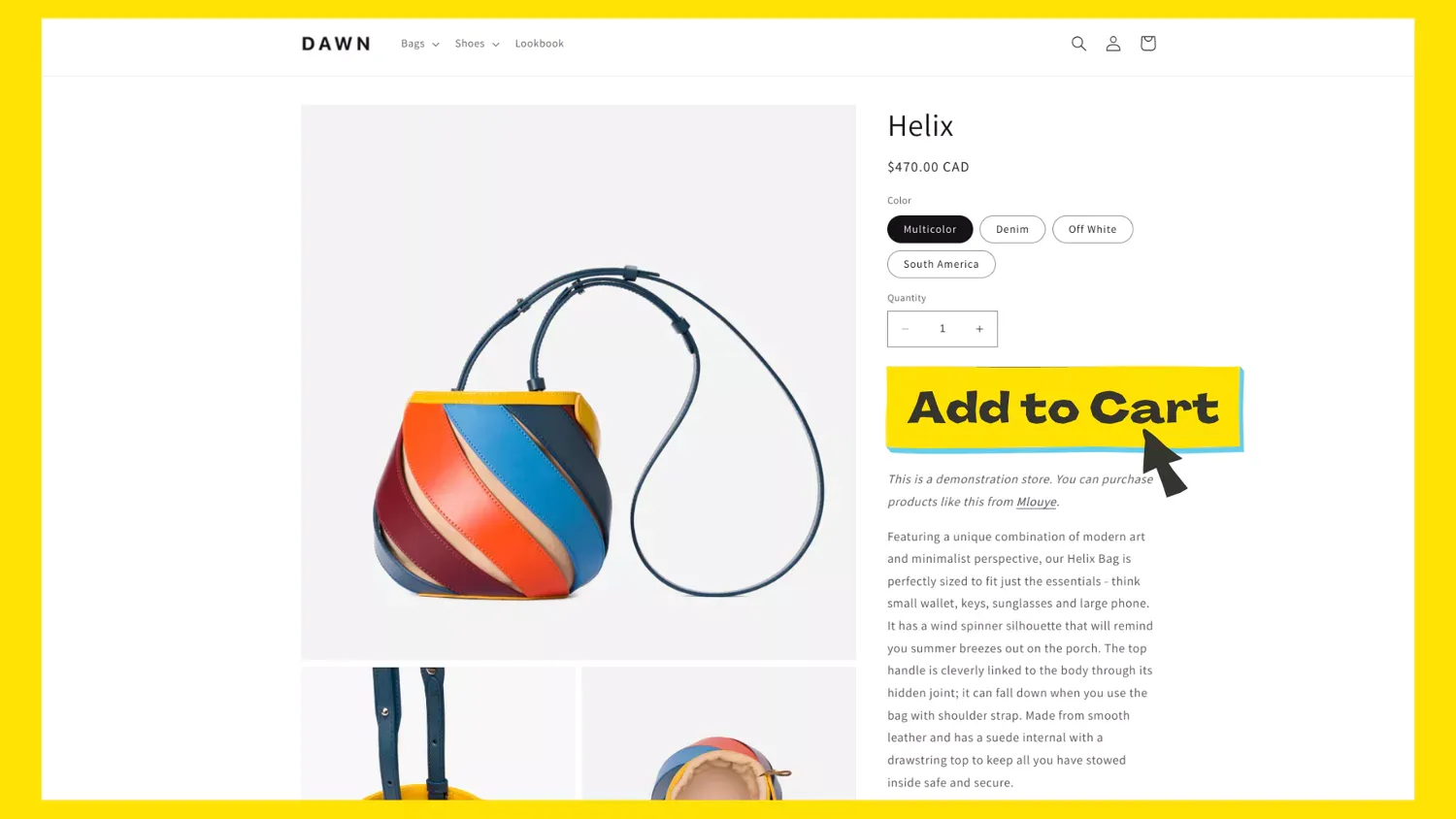
The Add to Cart button is the most important element on the page. It needs to be visible the moment the page loads, above the fold, and free from competing links or visual clutter. If a customer has to scroll or hunt for the buy button, you’ve already lost some of them.
Keep the language direct. “Add to Cart” or “Buy Now” works. Getting creative with CTA copy usually just confuses people. Buttons that say things like “Get Yours” or “Grab It” might sound fun in a brainstorm, but they add friction at the exact moment you want zero friction.
For a high converting Shopify product page, the CTA also needs to stand out visually. Use a contrasting color that’s distinct from the rest of the page. Don’t surround it with secondary buttons or links that pull attention away. One clear action, one obvious button.
Product Photography That Builds Trust
Customers can’t pick up your product and examine it, so your photos have to do that job. Good product photography isn’t just about looking professional. It directly affects whether people trust your store enough to buy.
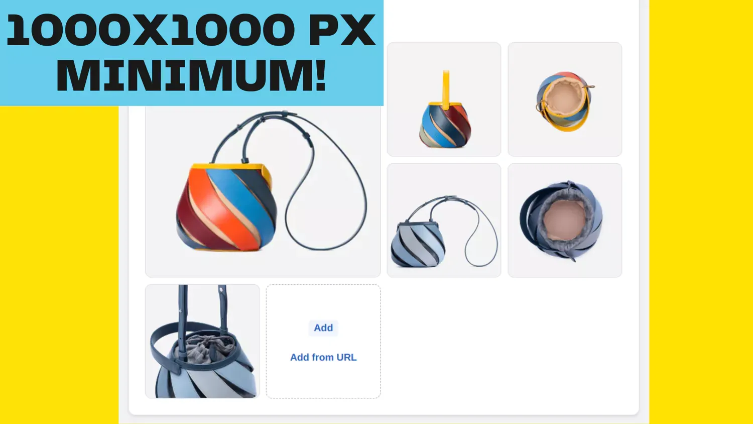
Here are a few Shopify product photography tips that matter more than most merchants realize. First, keep all your images at the same aspect ratio. When images have different dimensions, the gallery container resizes between slides, which creates a jarring “jumping” effect. Consistent ratios (like 1:1 for general products, or 3:4 for clothing) eliminate that problem.
Second, shoot at high resolution. Shopify handles image optimization automatically through its CDN, so upload the best quality you have. Images at 2048x2048 pixels or larger give customers a sharp zoom experience and keep your store looking crisp on retina displays. For the full breakdown of recommended dimensions, aspect ratios by category, and how Shopify’s CDN delivers responsive sizes, see our Shopify product image size guide.
Third, keep your lighting and backgrounds consistent across the catalog. This is one of those things that customers don’t consciously notice, but it makes the entire store feel more put-together and trustworthy. Inconsistent photo styles make a store look like it was thrown together in a hurry.
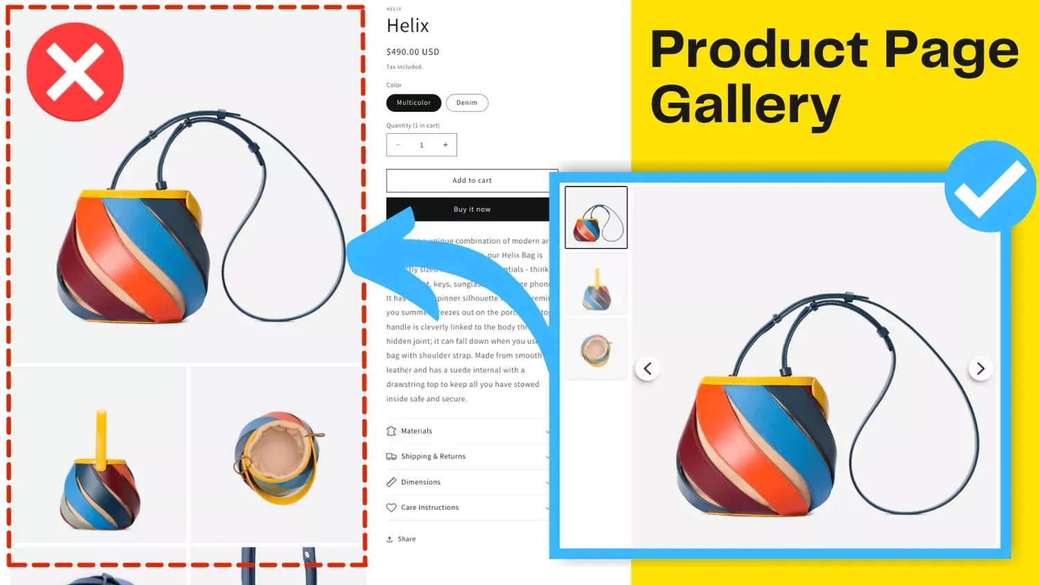
Assign Images to Product Variants
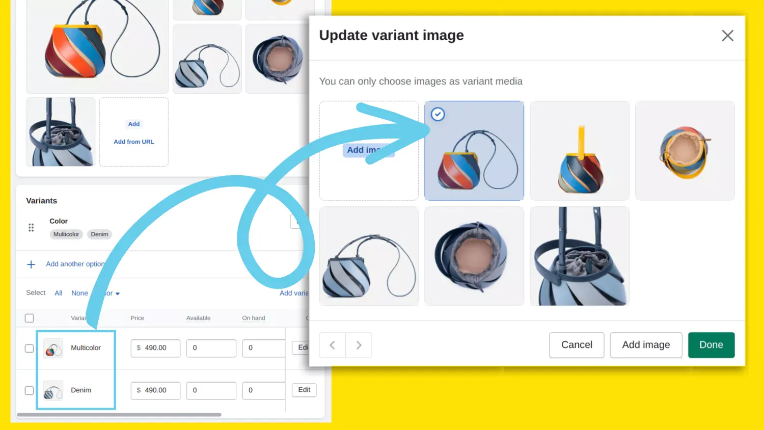
When a customer selects a different color or style, the product gallery should update to show images of that specific variant. This sounds obvious, but a surprising number of stores skip it. The customer ends up trying to guess what the blue version actually looks like based on a tiny color swatch.
Assigning images to each variant removes that guesswork entirely. People can see exactly what they’re getting before they add it to the cart. This is especially important for products where color accuracy matters (clothing, home decor, accessories). When customers feel confident about what they’re ordering, you get fewer returns and better reviews.
Shopify supports variant image assignment natively, but the default behavior is limited to one image per variant. If you need to show multiple angles for each variant, a gallery app can handle the variant image filtering automatically, hiding irrelevant images when a customer switches between options.
Organize Product Info with Description Tabs
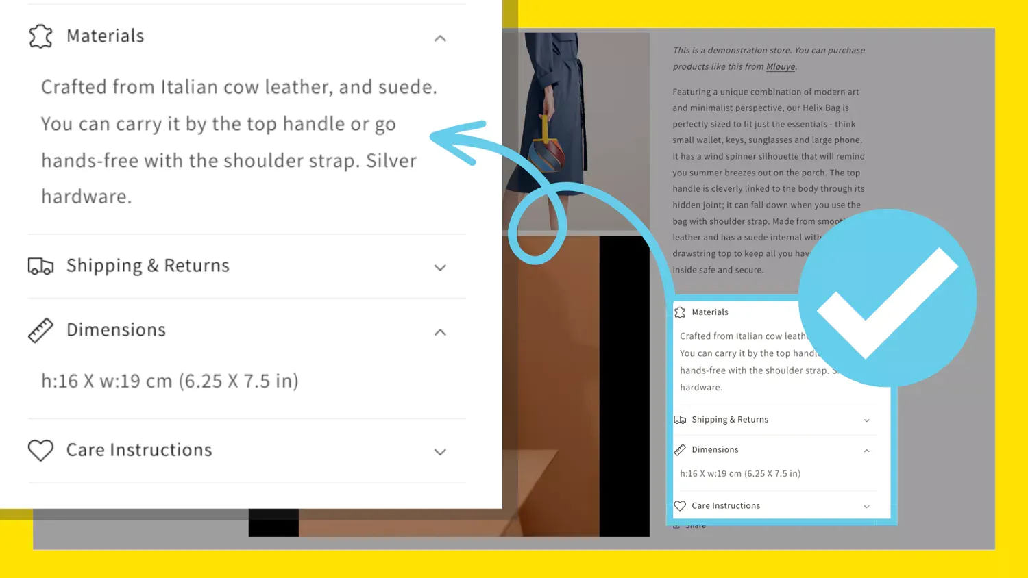
Long product descriptions that scroll forever don’t serve anyone well. Customers scan, they don’t read top to bottom. Description tabs let you break information into sections like specifications, features, care instructions, or shipping details so people can jump straight to what they care about.
This is one of the simplest Shopify product page layout improvements you can make. Instead of a wall of text below the gallery, you get organized, accessible content that respects the customer’s time. It also keeps the Shopify product page design looking clean and professional, which matters more than people think. A messy, disorganized page undermines trust, even if the product itself is great.
Consider what tabs make sense for your products. Most stores benefit from at least three: a main description, specifications or dimensions, and shipping or return information. If your products have care instructions or compatibility details, those deserve their own tabs too.
Product Gallery with Zoom and Swipe
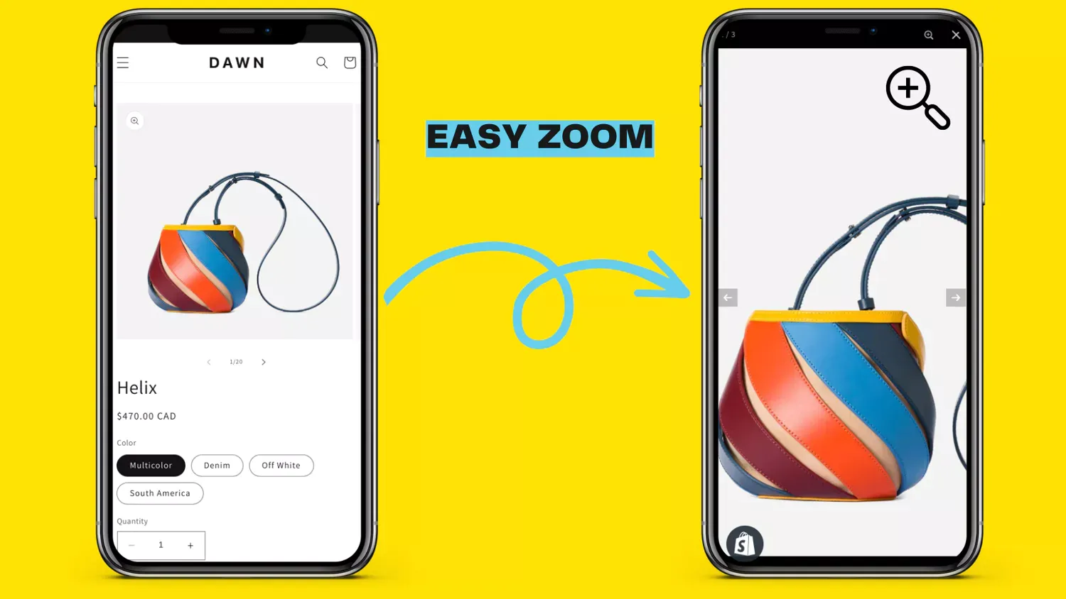
A good product gallery does more than cycle through a few images. Zoom lets customers inspect details up close, which is essential for products where texture, stitching, material quality, or fine print matters. Without zoom, you’re asking customers to trust that the details are right. With it, you’re letting them verify for themselves.
On mobile, the gallery needs to feel native. Swipe navigation should be smooth and responsive, not laggy or glitchy. Since most Shopify traffic comes from mobile devices, a gallery that works well on phones isn’t optional. It’s the baseline.
Other things worth having: automatic image switching when a customer selects a different variant, product video support for demos or reviews, and a Shopify product page layout that adapts between desktop and mobile without needing separate theme customizations. The default gallery in most Shopify themes handles the basics, but if you want zoom, video, variant filtering, or advanced navigation options, a dedicated gallery app gives you those features without touching any code. We compared the top options in our best Shopify image gallery apps roundup.
These Shopify product page layout best practices aren’t complicated individually. The ones that tend to get skipped (variant images, proper zoom, organized descriptions) are usually skipped because the default theme doesn’t make them easy. That’s where spending a bit of time on your Shopify product page design pays off. Whether you handle it through theme customization or a purpose-built app, getting these fundamentals right makes a measurable difference in how customers experience your store and whether they actually buy.
If the gallery section is the part you want to dig into next, our best Shopify image gallery apps comparison goes through the main options side by side. It covers what each app does well and where the trade-offs are, so you can pick one that fits your store without guessing.